Retail Design |
|
Food is an intimate |
|
OCT 9, 2014 |
|
 |
|
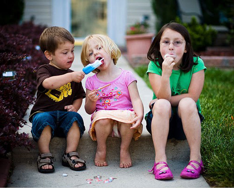
| PHOTO CREDIT : http://flickrhivemind.net/Tags/kyden/Interesting | |
| Food experiences are very unique. They touch more senses than most other retail experiences. With the design for food comes a certain responsibility, to entice and more importantly, to do it right. We all love ice cream and irrespective of age, it brings out the child in all of us. Ice cream is for everyone. Exploration:Boomerang, a proprietary run business for over 15 years started with softies and sundaes andmoved on to making gelatos too. The business now wanted to move into the premium ice cream market, aspiring to reach out to a new audience and market. With the growing demand for quality ice cream, Boomerang wanted to step up its brand experience and bring out new specialty products- ‘International quality indulgence at Indian prices’. The need for growth, expansion and business repositioning brought with it an opportunity for revitalization. A branding activity that would reinforce its– lasting flavours, affordability and quality in both B2B and B2C. Ideation:The client wanted an appealing theme that would reach across age groups. A place were ice creamlovers no matter whether old or young would be happy and comfortable coming to. Stores to be adaptable with variable product mix based on location and audience. Our brief led us to explore the universality of the ice cream experience rather than customize for a specific demographic. To design successful stores within the local text but to design for a broad customer range. Brainstorming took us back to the irresistable pleasures of ice cream and summer holidays. The places smells, sounds, textures of our experiences undoubtedly influenced our food memories. Definition:‘For the love of ice cream’ emerged as the key positioning. Boomerang would offer a variety ofproducts - the big fat super banana split for the ardent ice cream lover, swirls of ice cream confectionery for the lil’ kiddies, classics that fit your pocket money, guilt-free indulgences for the dieting food lover, creamy celebrations all the way, lasting flavours for lasting moments. For the love of ice cream, for everyone. Design would have to reflect quality and authenticity at the heart of the brand experience. Retail stores more often than not revolve around ‘themes’ to engage with customers. We explored the idea of ‘nostalgia’ through a whole range of imagery that would set you on flights of fantasy, on ferris wheels in your mind – to ice cream vans, cones, orange icesticks on the beach, to Saturday afternoons pushcarts ringing their bell arousing strong memories. A series was developed to tap into scenes that everyone would relate to in their own special way. It emphasized the idea of taste and pleasure. Design:The redesign of the store was defined by warmth of a traditional ‘parlour’ experience fused with contemporary simplicity. The logo elements were influenced by old school styling to make an authentic yet fashionable statement. ‘Farm house milk’ mark was developed as secondary communication to reinforce the quality of ingredient to customers. Ice cream is made in their own factory from fresh milk procured from their very own dairy.Pastel shades were inspired by a creamy ice cream palette, to keep a relaxing and pleasant environment. Burgundy pin cushion seating to bring out old world charm. Open brick wall painted white for a trendy vibe and giving character to the space. Ambient & spot lighting were used for highlights. A warm dimly lit cosy parlour with pastel coloured light domes to hang over every table like giant scoops of ice cream. A glass façade was incorporated to offer a good amount of natural lighting in the day and with it an entire face of window seating. The rest of the space used 2,4 & 6 seater tables. The customer journey was mapped right from location, approach, order, preparation, payment, delivery to consumption to ensure a wholesome experience. Customer Journey and store layout was planned for easy flow and minimum disturbance. Product strategy aimed at lasting flavours, tapping into the most loved flavours and combinations. An easy-to-read Menu to offer a good selection of products from premium ice creams, frozen desserts, shakes and sundaes, products that are both fixed and customizable(do-it-yourself). Product packaging from the cones, cups and straws to sundae dishes and soda glasses that are simple yet unique and make a statement. Product strategy focussed on naming, styling, embellishments and packaging to keep the food experience exciting and dynamic. Each product category to build itself as an individual product economy. Emergency chocolate, Nutty advice, Healthy nut (low calorie), Godzilla, jelly-belly (kids), were some of the catchy and exciting names developed to make products unique and memorable- it would influence the way the products are styled up. Special packaging was also developed for takeaway, gifting and B2B. Pricing strategy to suit a wider demographic. Products to be served up with by outgoing and friendly staff, outfit in uniforms designed to complement the brand environment, oozing with energy out of their love for icecream. The Store design is adaptable to various formats, neighbourhood stores & kiosks in malls. The brand redesign supported with franchise kits have helped Boomerang to grow with over 20 franchise outlets across over 9 cities in Tamil Nadu today. The ritual of eating is at the very core of our lives. We are connected to food in ways we may not even realize. This project allowed us to explore and embrace the activity of ice cream eating. The atmosphere, people’s interactions, the stories products carry, the nature of ingredients, the flavours, textures, colours, smells, the way it is prepared, dished and served, influence our experience and make a difference. Food is an intimate experience, a personal business. |
|
@ Viamedia 2024 |
|